A boring PowerPoint presentation wastes everyone's time. When information lacks visual appeal and clarity, audiences tune out. As seasoned presenters know, the key is balancing striking visuals with concise, impactful content to keep viewers hooked.
Done right, PowerPoint delivers engaging, memorable experiences. Done poorly, it induces yawns. Creating a custom template upfront saves hours later. These 7 proven tips, drawn from years of high-stakes presentations, ensure every deck shines.
Start a new presentation and go to View > Slide Master. This is your canvas—customize it to match your brand, project, or personal style with confidence.
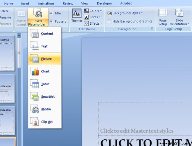
Edit the top Slide Master in the left sidebar to define consistent elements like logos, backgrounds, or footers across all slides.
Then tweak individual layouts for titles, content, or media slides. Use the Insert Placeholder tool on the ribbon to add editable spots for text, images, or videos later. For multimedia tips, see our guide on embedding YouTube videos in PowerPoint.
Satisfied? Go to File > Save As, select PowerPoint Template from the dropdown. Save to Microsoft Office > Templates for quick access.
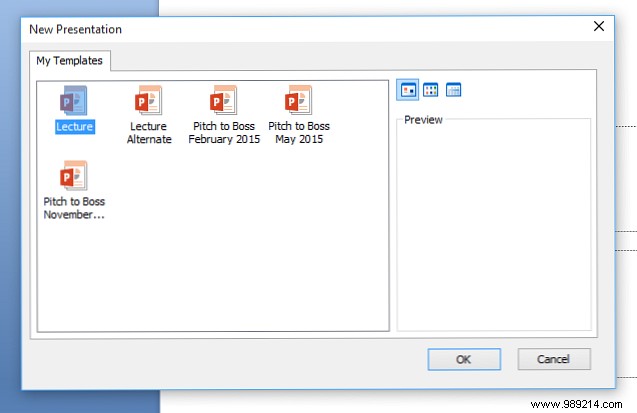
Open your template easily: Click the Office Button > New. Browse Installed Templates or My Templates for your custom designs.
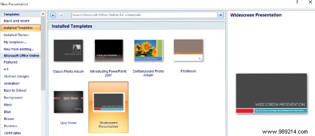
Use New from Existing to adapt past work. Explore free options via Microsoft Office Online—ideal for specialized needs. Learn more in our post on Office Online benefits.
Struggling from scratch? Base your template on a pre-built theme for instant professionalism and slide-to-slide harmony. Consistency builds trust and saves time.
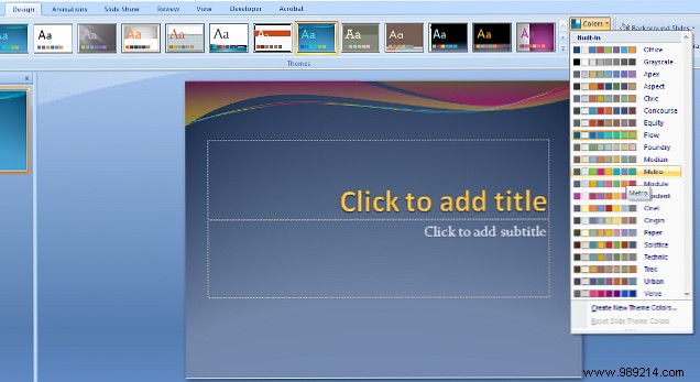
From the Design tab (under Themes), pick one. Customize via dropdowns for Colors, Fonts, and Effects. You'll craft a unique look while retaining polished cohesion. Need more? Check our roundup of free PowerPoint themes.
A great template streamlines work, but overuse breeds familiarity—and boredom. Audiences spot recycled decks, diluting your impact.
Refresh periodically; tweaking is faster than starting over. Chase fresh ideas that fit. Presentation style matters as much as content—explore data visualization tools to stand out.
Low-res images undermine even the slickest deck, especially on projectors. Test on your display first, but verify for larger screens.
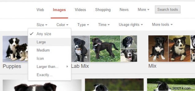
Source wisely: Stock libraries like Shutterstock deliver high-res files. For Google Images, click Search Tools > Size > Large (Medium often suffices). Preview on a projector. See our guides on copyright-safe images and Shutterstock Labs.
Fonts add flair but can sabotage readability. Limit to 2-3 per deck. From the back row, fancy scripts fail—prioritize clarity.
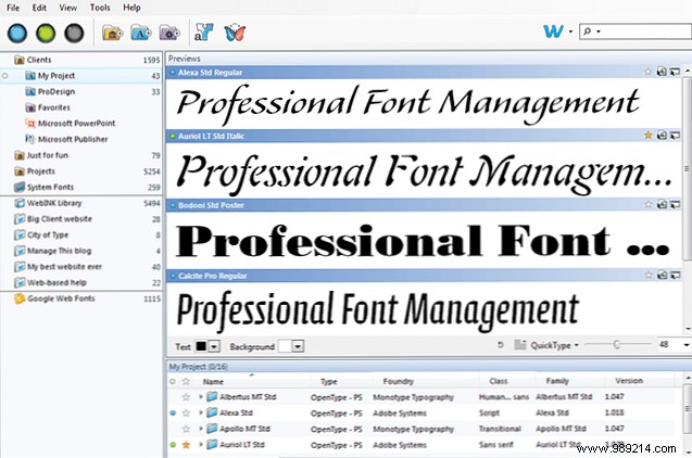
Pair a bold title font with clean, sans-serif body text like Arial or Calibri. Strong words, not gimmicks, win audiences.
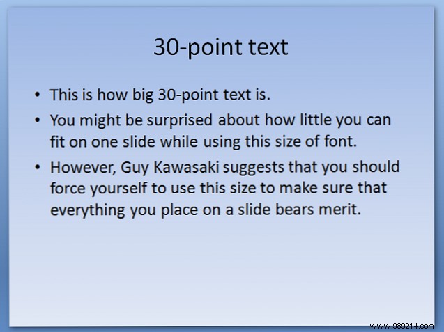
Venture capitalist Guy Kawasaki's timeless 10/20/30 rule: 10 slides, 20 minutes, 30-point font minimum. It enforces brevity and impact.
Design templates around this—preview 30-pt text sizing. It declutters slides, sharpens focus, and respects attention spans. Pair with audience insights for mastery. Details in Kawasaki's original and our attention span digest.
Got winning PowerPoint template tips? Share in the comments below!
Finalize by converting to PDF—formatting stays intact across devices. Our PDF to PowerPoint converter guide has you covered.