PDFs ensure your documents maintain consistent formatting across devices, making them ideal for sharing. To maximize impact, prioritize accessibility and readability. Follow these proven strategies from years of document optimization experience to create professional, user-friendly PDFs that engage readers effectively.
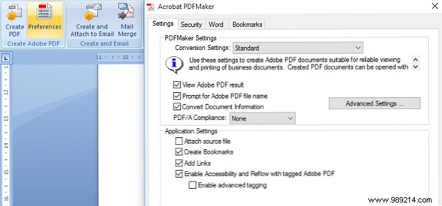
Tags are essential for PDF accessibility, providing the structure screen readers and apps need to interpret content correctly. Enable tagging before PDF creation to guarantee your document renders as intended.
In Adobe Acrobat, tagging is default. For Microsoft Word, check the Acrobat ribbon under Create Adobe PDF > Preferences. Verify Enable accessibility and reflow with tagged Adobe PDF is selected. Then, use Save as Adobe PDF instead of Office's basic export.
Auto-tagging handles most cases; manual tagging in Acrobat is available for complex needs.
Effective typography keeps readers engaged in text-heavy PDFs. Opt for sans-serif fonts, proven easiest to read on screens and print.

Leverage PDF's formatting fidelity with bold for emphasis on key words and italics for longer passages.
Strategic images break up text, aiding comprehension without overwhelming. Choose visuals that complement content—graphs or diagrams work well for data.

Plan visuals during drafting. Always add alt text or captions for screen readers and text-to-speech users.
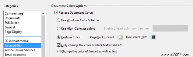
Avoid eye strain with high-contrast schemes beyond plain black-on-white. In Adobe Reader, go to Edit > Preferences > Accessibility, enable Replace Document Colors, and customize palettes.
Design with reader comfort in mind to ensure your message resonates.
Accessibility includes delivery. Use secure channels like company intranets or Dropbox for sharing.

Tailor for devices: For Kindles, email PDFs to your Send-to-Kindle address via Manage Your Content and Devices > Settings > Personal Document Settings.
Share your top PDF accessibility tip in the comments!