Microsoft Word offers a wealth of features, but mastering them doesn't guarantee stunning results. As a document design expert with years of experience crafting business reports and academic papers, I've seen how thoughtful design elevates content from ordinary to exceptional.
This guide focuses on timeless design principles—the what and why—rather than step-by-step feature tutorials. These rules create documents that are easy to read and visually appealing. They apply equally to tools like Google Docs; for specific tips, see our article on 10 Easy Ways to Create Beautiful Google Docs.
Every tip here stems from this core principle: keep it simple. Let content shine by maximizing white space, tightening prose, and proofreading rigorously. Avoid flashy distractions—format serves readability.
Choose wisely: Serif fonts (e.g., Garamond, Georgia, Hoefler Text, Palatino) excel in print for their readability. Sans-serif options (e.g., Arial, Gill Sans, Helvetica, Lucida Sans) suit screens better.

Stick to one font body-wide, with a complementary one for headings if desired. Dive deeper into pairings with our guide on font pairing strategies and tools.
Opt for 12-point font for optimal readability in academic and business docs (10-point minimum for dense reports). Reserve color for warnings; rely on bold and italics for emphasis, especially in print to avoid ink costs and copy issues.
Default to US Letter (8½" x 11") or A4 (210mm x 297mm) for universal compatibility.
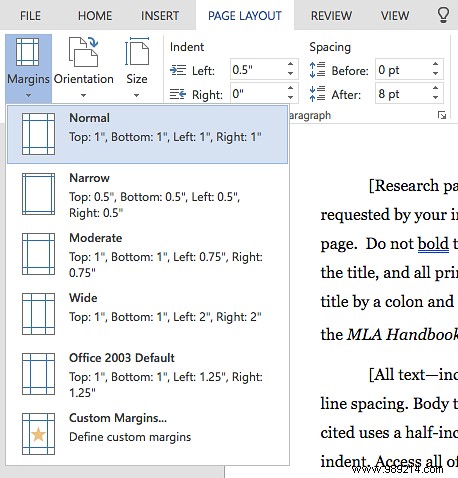
Set 1-inch margins all around for ideal line lengths and annotations. Increase inner margins to 1½" for binders.
Skip justified alignment—its even edges create distracting 'rivers' of space. Left alignment preserves natural spacing, ensuring smooth reading flow despite ragged right edges.
Omit space between paragraphs; instead, indent first lines (match font size) to define them clearly. Skip for paragraphs post-heading. Use Word's styles, not tabs.
For charts, graphs, and tables, place images between paragraphs and center them. This prevents text competition and highlights captions, outperforming text-wrap in reports.
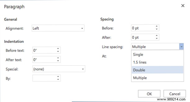
Academic papers: Double-space or follow style guides. Business docs: Single-space for print efficiency; 120-150% for digital ease.
Headings organize long docs—prefer structured sections over text walls. Use numbered lists for sequences/steps, bullets otherwise, sparingly.
Word's section breaks enable page-specific tweaks:
Ideal for chapters; use 'Next Page' or even/odd for binders.
Skip setup with proven templates: 15 Business Letter Templates, 15 Best Cover Templates, Top 10 Table of Contents Templates, and Project Management Templates. Master essentials via 9 Office 2016 Tips, key keyboard shortcuts, and 7 tricks from Office champions.
What design tips make your docs stand out? Share in the comments!