While Microsoft can't foresee the future with absolute certainty, Excel's robust time series forecasting features excel at extrapolating trends from your historical data. This tool uncovers hidden patterns, offering valuable insights into potential outcomes. It's not flawless, but it reveals what your data is truly indicating. For foundational data analysis in Excel, check out our guide on basic data analysis techniques. Think of it as a glimpse into tomorrow.
There are two primary ways to forecast in Excel: cell-based functions or the user-friendly Forecast Sheet interface. We'll focus on the latter for its simplicity and visual appeal. For in-depth function details, refer to Microsoft's official forecasting guide, but the Forecast Sheet is our top recommendation.
Before diving in, understand the mechanics. Excel employs triple exponential smoothing (ETS), a proven algorithm that analyzes patterns in your data. ETS prioritizes recent values over older ones, ensuring predictions reflect current trends accurately.
For a clear, mathematician-friendly explanation of exponential smoothing, Gregory Trubetskoy's guide is outstanding. Though complex, it emphasizes how recent data drives forecasts. Excel provides customization options, which we'll explore shortly.
Excel requires a structured format: at least two columns. The first is a timeline with consistent intervals—dates, times, or sequential numbers. Irregular spacing, like sales on Jan 1, Feb 1, Mar 1, Apr 1, Apr 15, May 1, reduces accuracy. Learn more in our date calculation tutorial.
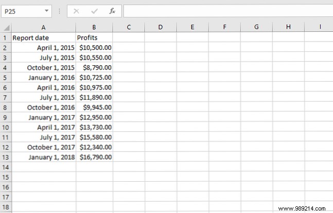
The second column holds your values to forecast. For this guide, I've prepared a sample spreadsheet with fictional monthly sales data, drawing from real-world business scenarios I've analyzed.
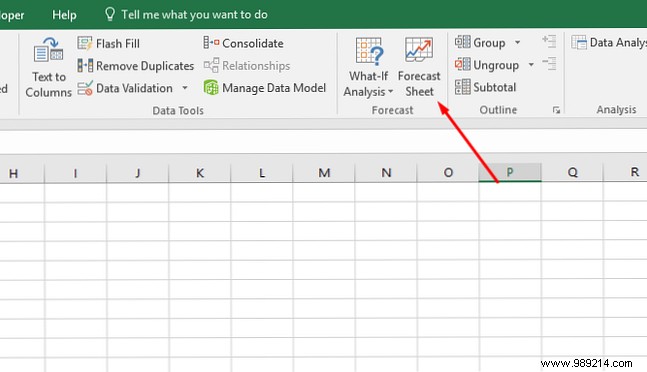
Select your data range, then navigate to Data > Forecast Sheet.
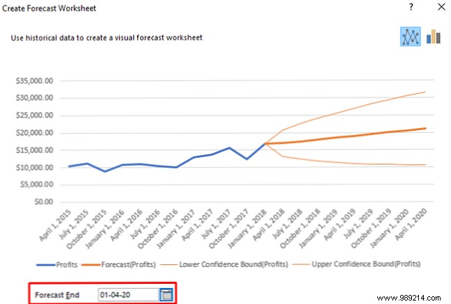
A preview chart appears: historical data in blue, predictions in orange.
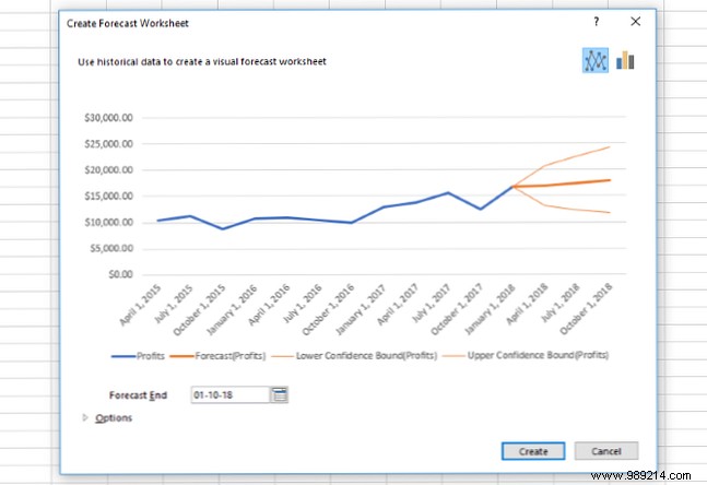
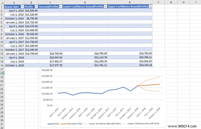
Click Create to generate a dedicated sheet with the chart, forecast table, and 95% confidence intervals—essential for assessing reliability.
This baseline forecast is powerful, but customization refines accuracy further.
The Create Forecast Worksheet dialog starts with the Forecast End dropdown, controlling prediction horizon. Longer periods widen uncertainty.
Click Options for advanced settings.
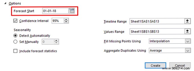
Forecast Start: Typically after your last data point. Test earlier to validate against known values, but default suffices for most cases.
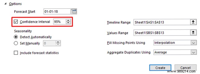
Confidence Interval toggles bands and sets levels (95% is standard, indicating 95% probability the true value falls within).
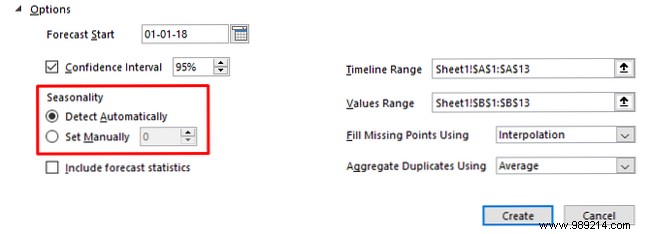
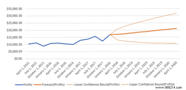
Seasonality captures repeating cycles. Excel auto-detects, but manual tweaks yield better results. In our sales example, setting to 4 (quarterly cycles) improved alignment:
Auto-detected:
Manual (4):
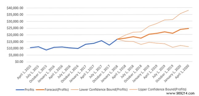
This better captured typical October slowdowns. Experiment: monthly data uses 12, annual weekly 52, half-year 26.
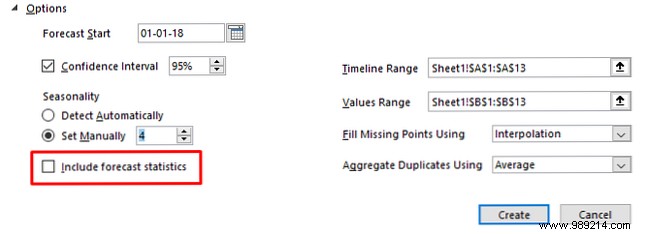
Check Include forecast statistics for metrics like alpha, beta, gamma, MASE, SMAPE:
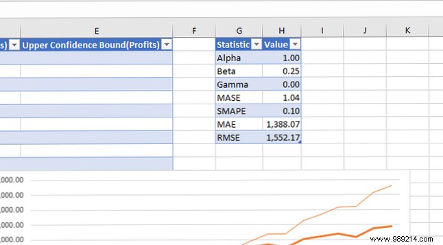
These gauge model performance—valuable for experts.
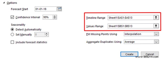
Timeline Range and Values Range define inputs; adjust if auto-selection errs.
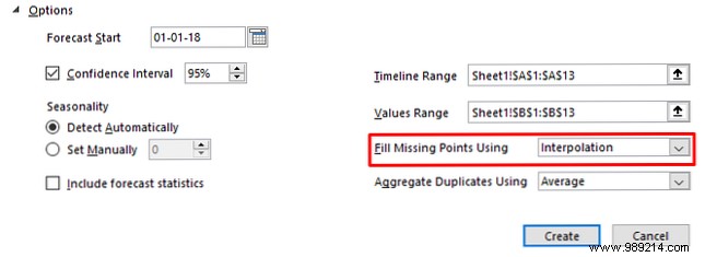
Fill missing points using: Interpolation (weighted averages of neighbors) is default and best for gaps. Avoid Zero unless truly zero.
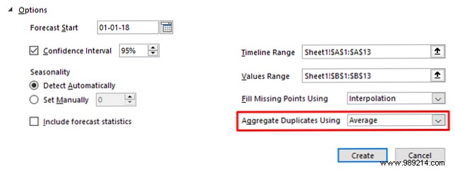
Aggregate duplicate values: Handles multiple entries per timepoint (default: average; options: sum, median, etc.).
Finalize with Create for your optimized forecast sheet.
Armed with these steps, leverage historical data for forward-looking insights in Excel. It's ideal for business forecasting. Enhance further with add-ins like those in our top 10 Excel power-ups.
Do you use Excel's forecasting? Share tips for newcomers in the comments!