Discover six advanced chart types introduced in recent Excel versions. As an experienced data analyst, I've relied on these tools to transform complex spreadsheets into compelling visuals that drive insights.
While classic pie charts and scatter plots have their place, these newer options offer greater flexibility for professional analysis. They're ideal for quality control, financial tracking, and hierarchical data—perfect for elevating your reports.
With these charts in your toolkit, you'll communicate data more effectively, whether in Excel, PowerPoint, or dashboards. Enhance Your PowerPoint Presentation With Excel Data Visualizations shows how to integrate them seamlessly. Let's dive in.
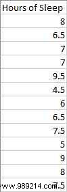
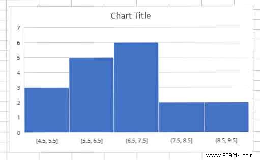
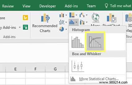
A histogram displays the frequency distribution of a dataset in bins, revealing patterns like skewness or outliers at a glance.
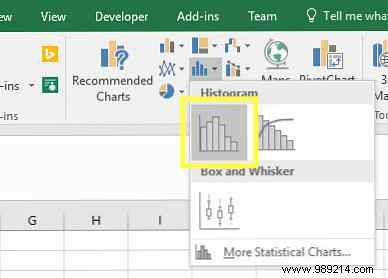
Select your single-column data, go to the Insert tab, Charts group, and choose Insert Statistic Chart > Histogram.
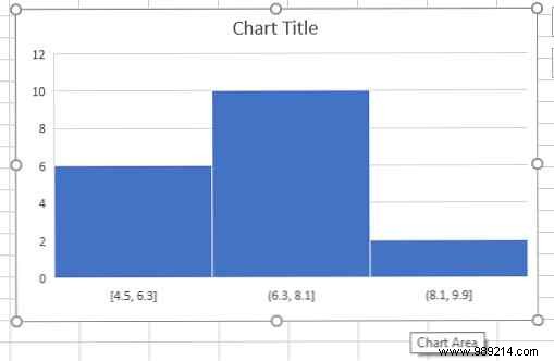
Excel auto-creates bins, like 4.5-6.3, 6.3-8.1, and 8.1-9.9 hours of sleep in this example.
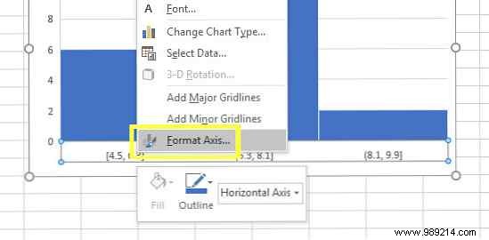
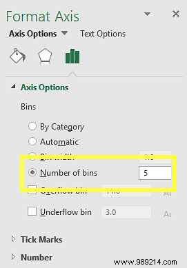
To customize, right-click the x-axis, select Format Axis, and adjust under Bin Width or set Number of bins to 5 for better granularity.
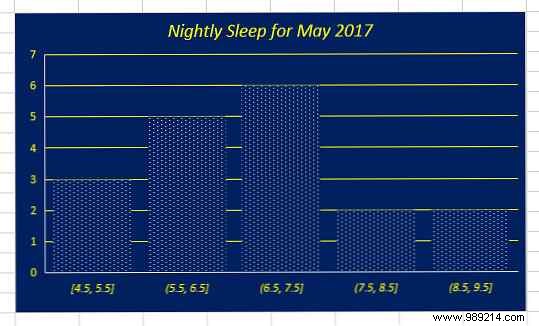
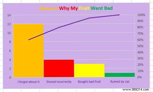
Fine-tune layout, colors, and labels for a polished result.
Pareto charts sort categories by descending frequency, with a cumulative line—essential for prioritizing issues in quality control or process improvement, following the 80/20 rule.
Select your data (categories and values), go to Insert tab > Charts > Insert Statistic Chart > Pareto.
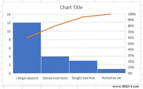
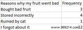
Here, addressing top issues like forgotten fruit, improper storage, and bad purchases eliminates 90% of waste. Enhance with formatting. For more, see our 9 Tips for Formatting an Excel Chart in Microsoft Office.
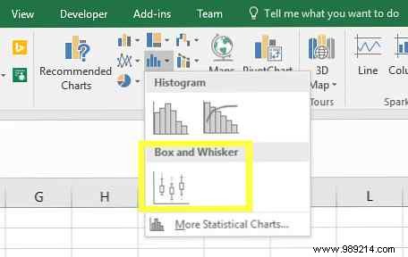
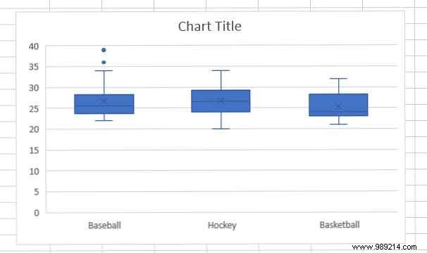
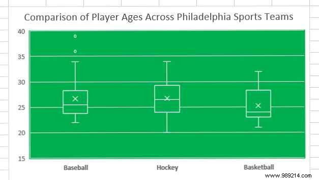
Box and whisker plots summarize data distribution: median, quartiles, and outliers. Great for comparing ranges across groups, like player ages on sports teams.
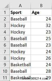
With ample data, select it, then Insert > Insert Statistic Chart > Box and Whisker.
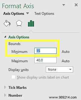
Reduce dead space: right-click y-axis > Format Axis, set min to 15 and max to 40.
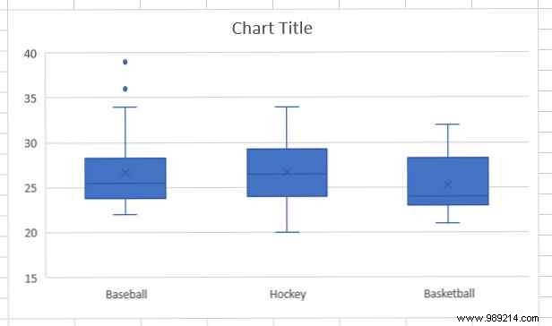
This highlights tight basketball age ranges versus baseball outliers.
Treemaps show hierarchical proportions via nested rectangles—ideal for sales breakdowns by category and subcategory.
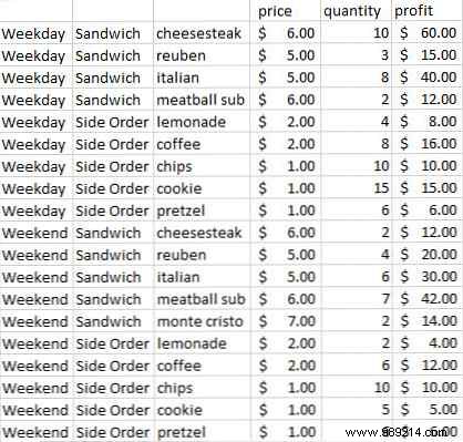
Organize data with categories (e.g., Sandwich/Side, Weekday/Weekend) and values. Select columns A, B, C, F (hold Ctrl for non-contiguous).
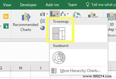
Insert > Charts > Insert Hierarchy Chart > Treemap.
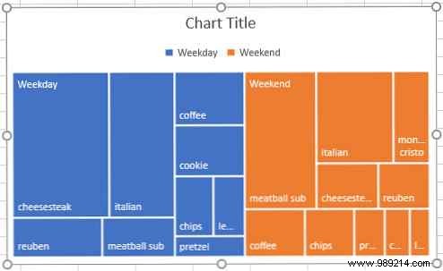
Quickly spot top performers across hierarchies.
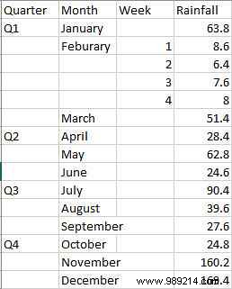
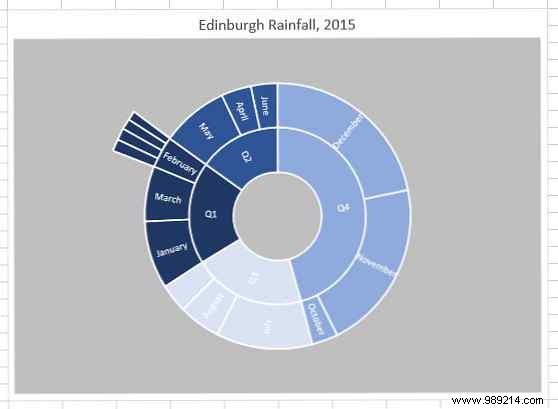
Sunburst charts visualize multi-level hierarchies radially, like stacked pie charts for rainfall by quarter, month, and week.
Select data, Insert > Charts > Insert Hierarchy Chart > Sunburst.
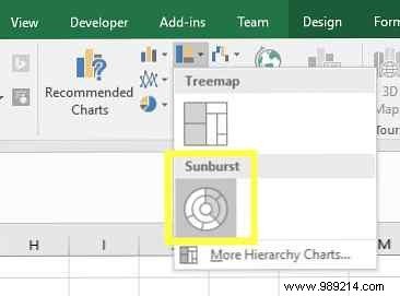
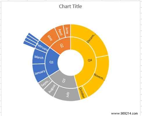
Inner rings show quarters/months; outer details weeks.
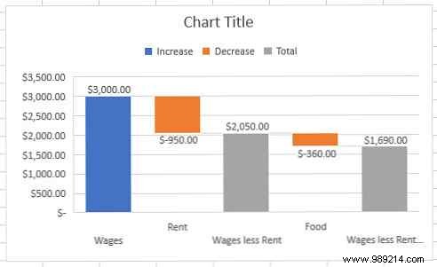
Waterfall charts track running totals with positive/negative bars—perfect for P&L statements.
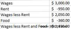
Enter negatives in brackets (e.g., [Rent]). For formulas, add cells since negatives flip subtraction. Select data, Insert > Charts > Insert Waterfall or Stock Chart > Waterfall.
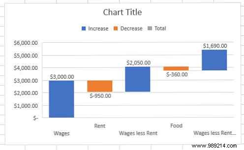
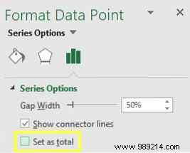
Double-click bars like 'Salary minus Rent' > Format Data Point > check Set as Total to anchor them.
Excel's charting prowess shines when matched to your data. Review 8 Types of Excel Charts and Graphs and When to Use Them or 10 Easy Excel Time Savers You Might Have Forgotten.
A Pareto uncovers priorities; a sunburst reveals hierarchies. Experiment thoughtfully for maximum impact.
Share your visualization tips or chart challenges in the comments—let's level up together!