As a data analyst with over a decade of experience using Excel for business reports and presentations, I've seen how poor visuals can undermine great data. Professional charts convey insights clearly and persuasively. This guide draws from real-world UK population data (1951-2011) to show you step-by-step how to elevate your Excel charts.
Selecting the appropriate chart prevents misuse and enhances clarity:
Focus on these essentials first; advanced types like bubble or sparkline come later.
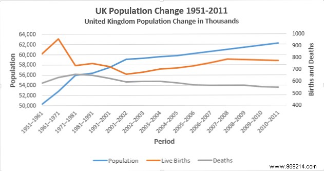
Using UK population data (population, live births, deaths):
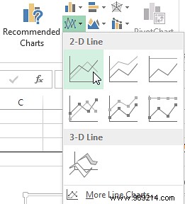
Select the data, go to Insert > Line Chart.
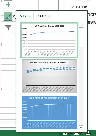
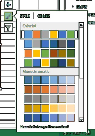
Access styles via the right pane. Choose professional colors and layouts—effective as datasets grow.
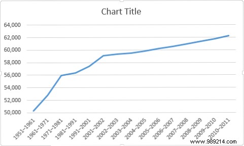
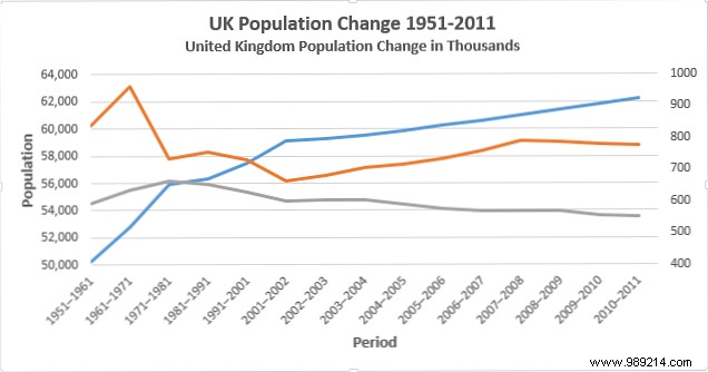
Click the vertical axis to open Format Axis. Adjust bounds (e.g., minimum from 0 to 50,000) for impact.
Add axis titles: Chart Tools > + > Axis Titles. Use Population (vertical) and Period (horizontal), bold and size up.
Expand data to include births/deaths. Right-click chart > Change Chart Type > Combo. Assign births/deaths to secondary axis (line chart).
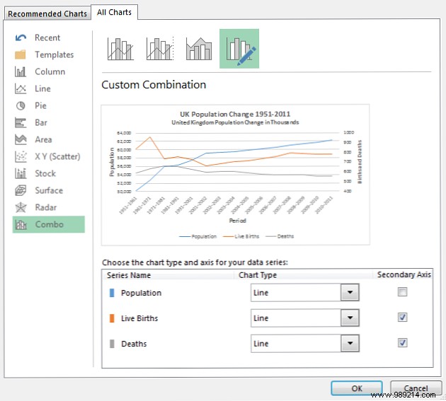
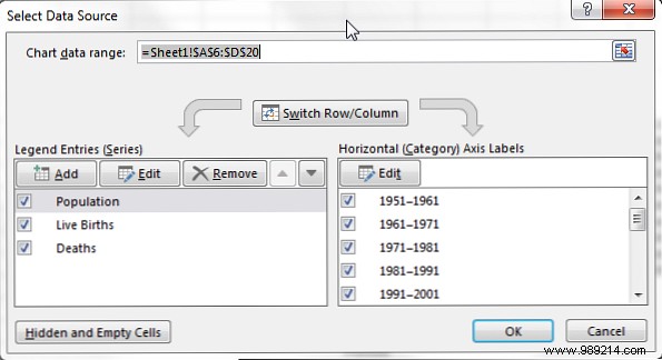
Add legend (+ > Legend > Bottom). Edit names via Select Data.
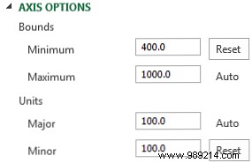
Format secondary axis (min 400, major unit 100). Adjust horizontal axis position to On tick marks.

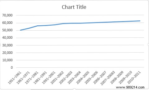
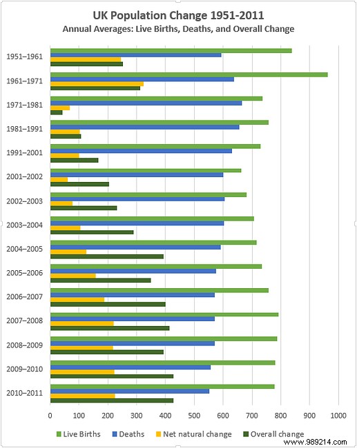
Title: UK Population Change 1951-2011
Population in thousands.
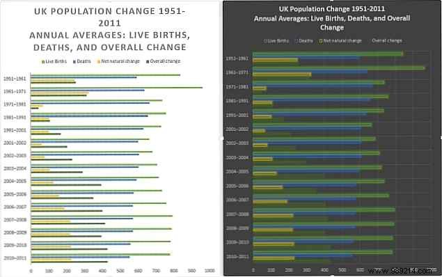
Select live births, deaths, net natural change, overall change. Insert Clustered Column.
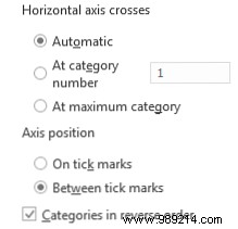
Double-click vertical axis: Check Categories in reverse order and At maximum category.
Horizontal axis: Max 1000, major unit 100. Series options: Gap width 125%.

Title: UK Population Change 1951-2011
Annual averages: live births, deaths, overall change. Enhance legend font.
Use Paintbrush icon for presets. Select colors distinguishing series (e.g., green for births, red for deaths).
Research shows clean charts outperform text in changing minds—even on contentious topics. Next time, let your data shine.
What's your go-to chart tip? Share below!