Transform static Excel charts into engaging, interactive visuals with this proven technique using the INDEX function and a simple dropdown menu.
Excel makes it straightforward to generate clear charts from raw data, but they often feel rigid and uninspiring. While strong formatting elevates them—check our guide on 9 Tips for Formatting an Excel Chart in Microsoft Office for pro techniques—adding interactivity truly brings dashboards to life.
A dropdown menu lets users switch datasets effortlessly, displaying multiple views in one chart. It's ideal for Excel dashboards and takes just minutes to implement.
Follow this step-by-step guide, based on real-world dashboard projects, to master interactive charts.
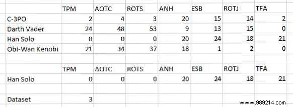
Start by organizing your data. For this example, I'm charting screen time for Star Wars characters:
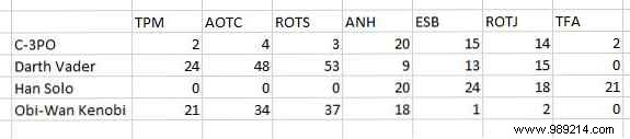
Structure your data in contiguous rows. Once set up, you'll toggle between characters like C-3PO and Darth Vader, pulling the relevant info dynamically.
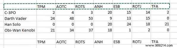
Next, copy your header row and paste it below the data.
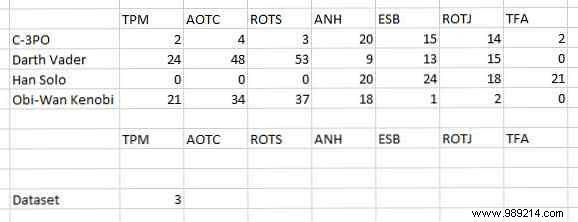
Skip three rows down, enter "Dataset" in one cell, and a placeholder number (like 1) in the next. This will drive your dropdown later.
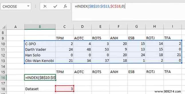
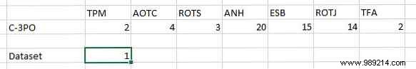
Link it all with the INDEX function. Two cells above Dataset, enter:
=INDEX($B$10:$I$13,$C$18,0)If INDEX is new to you, see our tutorial: Search Excel Spreadsheets Faster: Replace VLOOKUP with INDEX and MATCH. Here, $B$10:$I$13 is your full data range, $C$18 is the selector cell (next to Dataset), and 0 specifies the row based on that number.
Adjust ranges to match your setup:
Drag the formula across the row to fill headers.
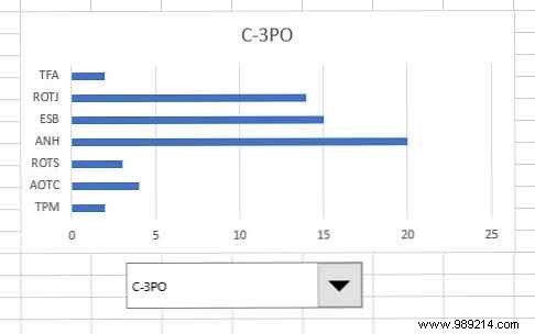
Verify by changing the number next to Dataset—the cells update. Enter 1 for C-3PO data:
Select the INDEX-generated data (not raw input) and insert a chart. For details, read How to Create a Pie Chart in Microsoft Excel.
Go to Insert > Recommended Charts on the ribbon.
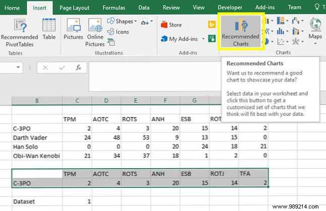
Choose any type—bar works well here. Learn more in 8 Types of Excel Charts and When to Use Them.
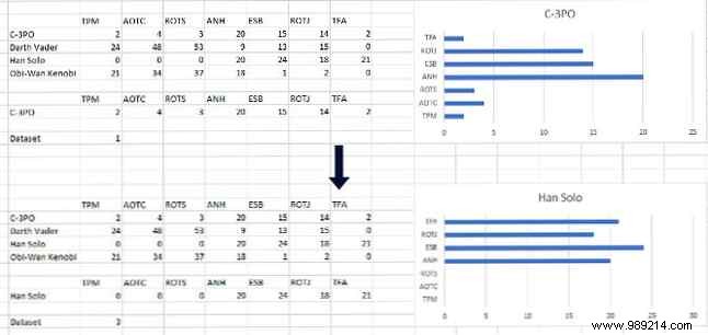
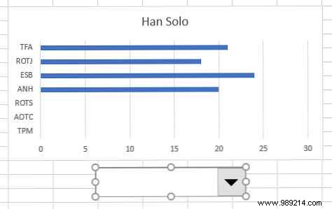
Test by updating the Dataset number; the chart should refresh.
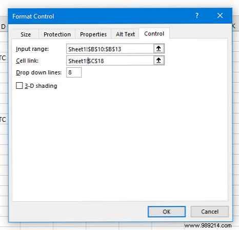
Enable the Developer tab if needed, then Insert > Combo Box (Form Control).
Draw the dropdown below your chart.
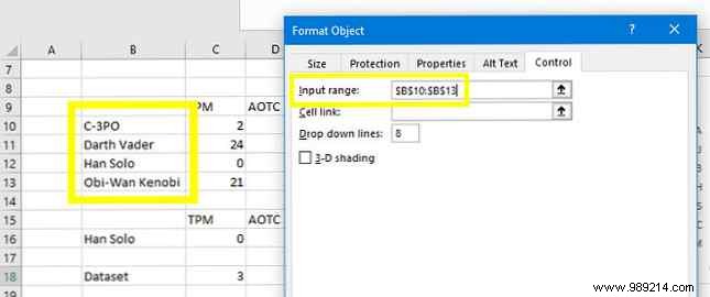
Right-click > Format Control. Set Input range to your dataset names.
Link Cell link to the Dataset number cell.
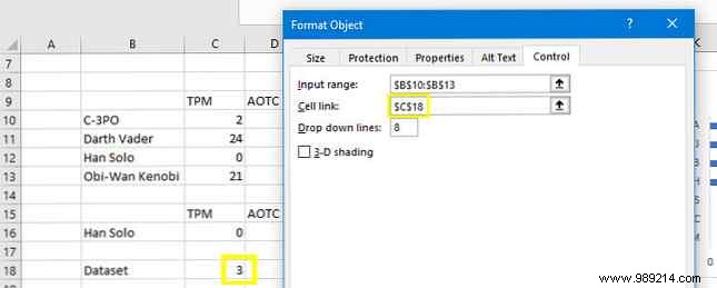
Click OK—selecting from the dropdown now updates the chart instantly.
Polish visuals with tips from How to Create Powerful Charts and Graphs in Microsoft Excel. For a clean dashboard, copy the chart and dropdown to a new sheet. Update Format Control references by prefixing Sheet1! to cell addresses.
Final result:
Excel dashboards shine by distilling complex data—see Visualize Your Data with an Excel Dashboard. But overload confuses viewers.
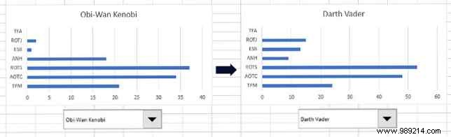
Interactive charts solve this: users filter datasets on demand, maximizing space for diverse topics. Use side-by-side charts for direct comparisons when needed.
Share your Excel chart tips or questions in the comments!
Explore 6 New Excel Charts and How to Use Them next.