Preparing for a big presentation? Impress your audience by transforming complex data into clear, visually striking charts. The key is selecting the right Excel chart type for your data story.
Excel offers versatile charting tools to display data in compelling formats. In this guide, drawn from real-world analysis of 2010 U.S. Census data from data.gov, I'll walk you through eight key chart types, complete with examples and step-by-step creation tips. These insights come from years of building dashboards and reports for business and government datasets.
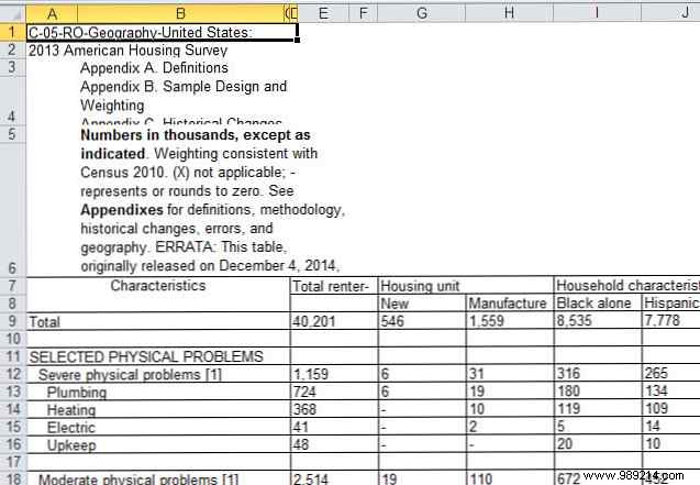
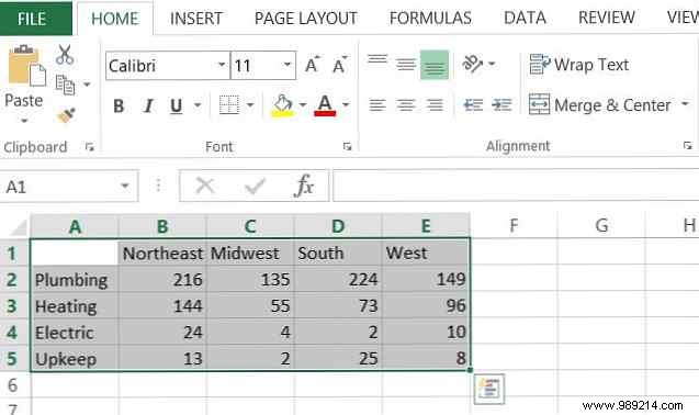
The U.S. Census provides rich, free public data on demographics and housing. For these examples, we'll analyze renter-reported home issues across the four U.S. regions.
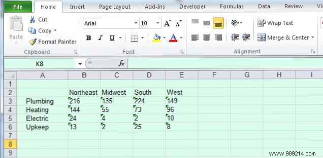
This focused dataset is perfect for straightforward visualizations. Always start by assessing what your data represents—categories, trends over time, or correlations—and match it to the ideal chart.
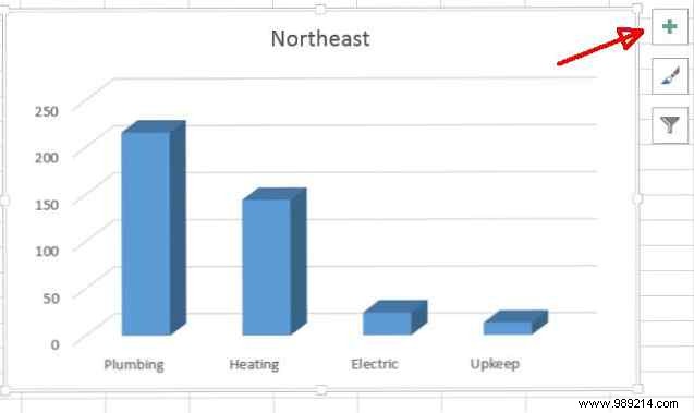
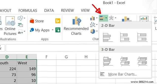
Column charts are presentation staples for comparing categorized values, like regional differences in renter issues.
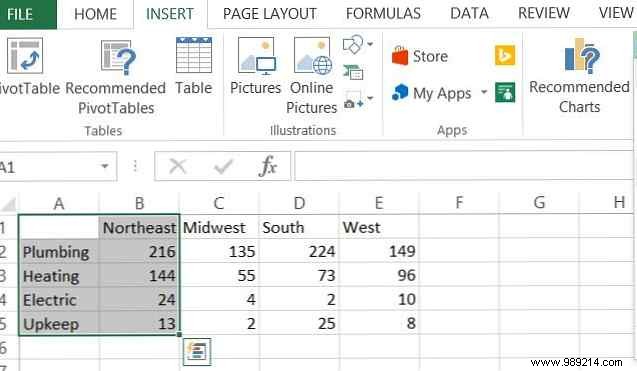
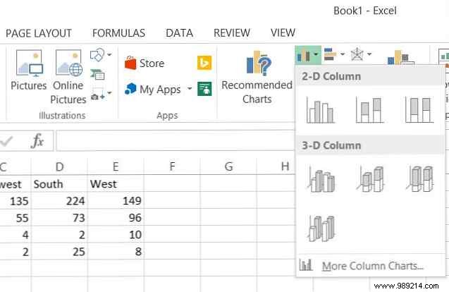
Select your data, go to Insert > Column (2-D or 3-D for depth). I prefer 3-D for visual impact on categorical comparisons.
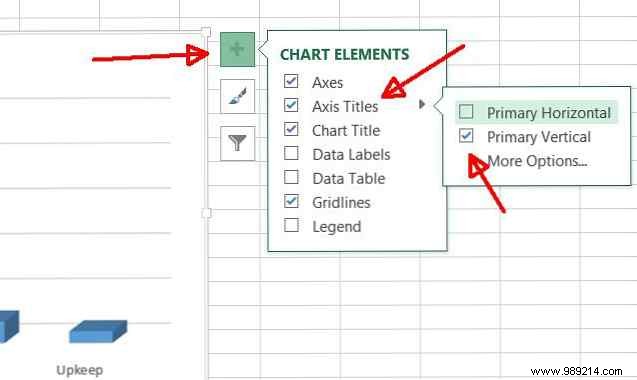
Add labels via the + button > Axis Titles > Primary Vertical.
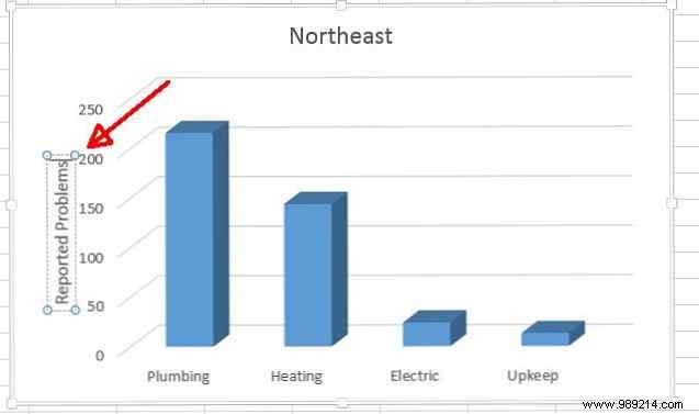
Here, Northeast plumbing and heating issues stand out clearly. For broader comparisons, switch to bar charts (horizontal columns).
Select all data, Insert > Bar.
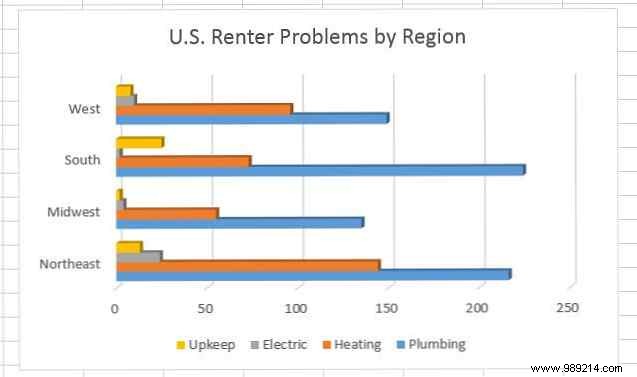
Pro Tip: Edit the chart title by clicking it (or use Chart Tools in older versions). This view reveals plumbing woes in the South and Northeast, plus Southern maintenance struggles.
Pie charts excel at showing proportions within a whole, like Northeast renter issues by type.
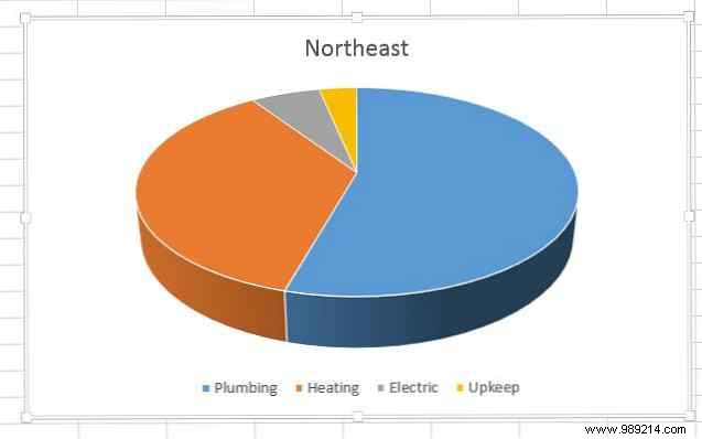
Best for single datasets with clear categories; use bars/columns for multi-set comparisons.
Line charts track changes over time or sequences, like U.S. population growth from 2010-2015.
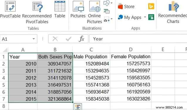
Select year and population columns, Insert > Line. Right-click > Select Data to set years as X-axis.
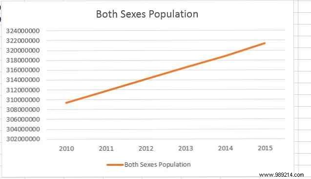
Spot the steady 0.76% annual growth instantly.
Area charts emphasize magnitude over time, filling under the line. Compare male vs. female population growth:
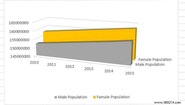
Or stacked for breakdowns:
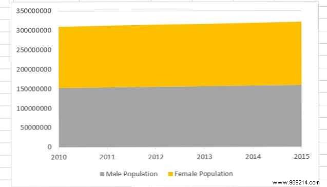
Reveals females outnumber males by ~3%, but males grow faster.
Scatter plots uncover correlations, like Chicago asthma hospitalizations by ZIP code (2000-2011).
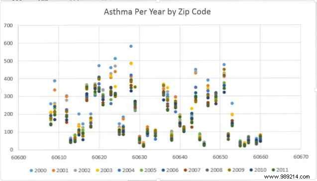
60628 sees the most; 60655 the least.
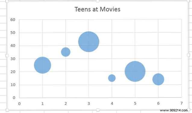
Bubble charts add a third dimension (bubble size). Great for multifaceted data.
3D surface charts map two variables, like topography.
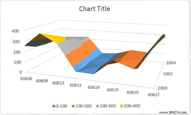
Ideal for patterns in age, time, and magnitude.
Doughnut charts layer multiple pies for subcategories over time, like male/female population yearly.
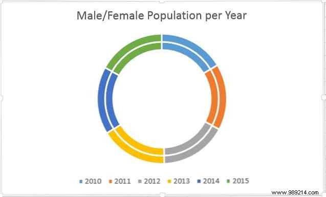
Highlights subtle shifts.
Match charts to your data: categories (columns/bars/pies), trends (lines/areas), relationships (scatter/bubble/surface). Proper organization and formatting amplify impact—elevate your presentations today.