As a data analyst with years of experience using Excel for statistical analysis, I've relied on the correlation coefficient countless times to reveal relationships between variables. It's one of the simplest yet most insightful stats tools available—far easier than you might think with the right functions.
This guide draws from real-world applications to walk you through what correlation means, two reliable methods to compute it in Excel, visualization tips, and a brief on linear regression for deeper insights.
Correlation measures the strength and direction of the relationship between two variables. Consider this scatter plot of unrelated data:
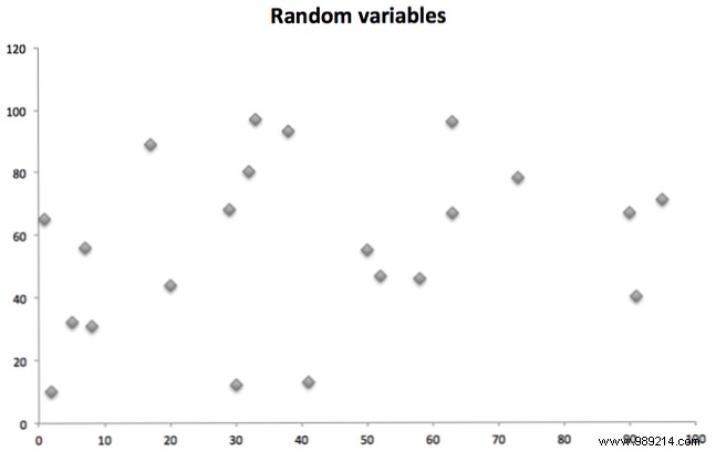
These points (X-axis vs. Y-axis) show no pattern—pure randomness.
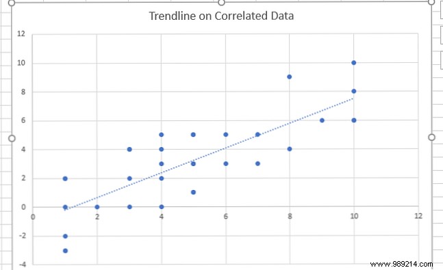
Now compare this positively correlated pair:
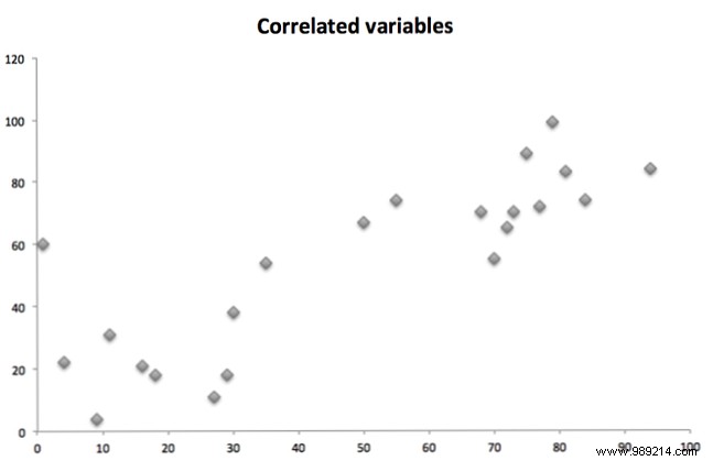
As one variable rises, so does the other. (Negative correlation flips this: one rises, the other falls.)
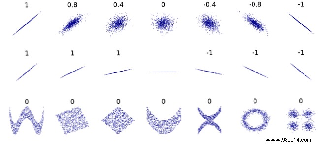
The coefficient ranges from -1 to 1. Zero means no linear relationship (like random data). -1 is perfect negative correlation; 1 is perfect positive. Values in between indicate strength: e.g., 0.5 is moderate positive.
Note: Correlation detects linear relationships only. Nonlinear links can yield zero despite strong ties:
Excel's built-in CORREL function is straightforward: =CORREL(array1, array2)
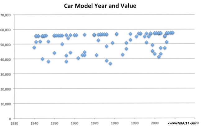
Enter your two data ranges, and it returns the coefficient instantly. Example: Analyzing car model years vs. values.
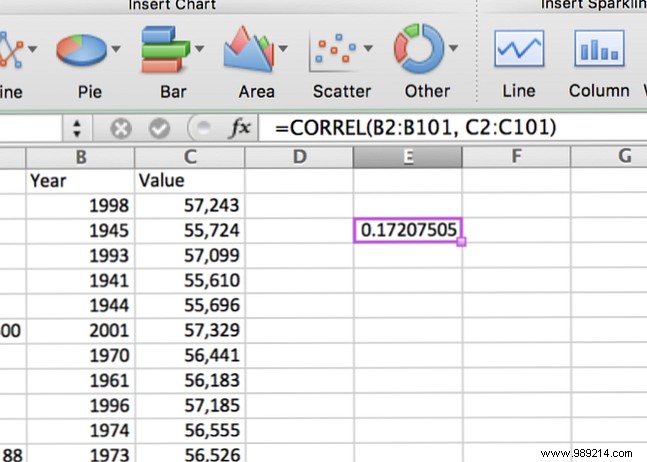
Result: Weak positive correlation (newer years slightly boost value).
Always pair correlations with scatter plots for intuition. Insert via Insert > Charts > Scatter:
The faint upward trend matches our CORREL result. Add a trendline (Windows: Chart Tools > Design > Add Chart Element > Trendline; Mac: Chart Design) for clarity:
Master charts? See our guide: How to Create Powerful Graphs and Charts in Microsoft Excel.
For datasets galore, use the ToolPak to matrix all pairwise correlations. Enable it first (Data > Data Analysis).
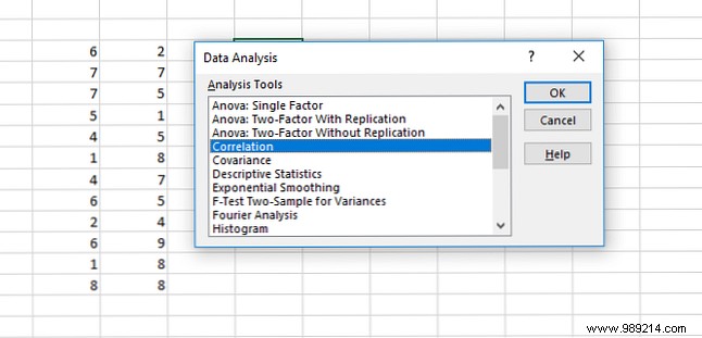
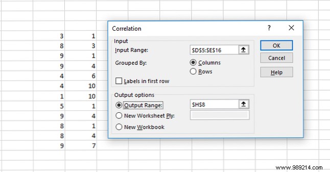
Select Correlation, input range, output location:
Output:
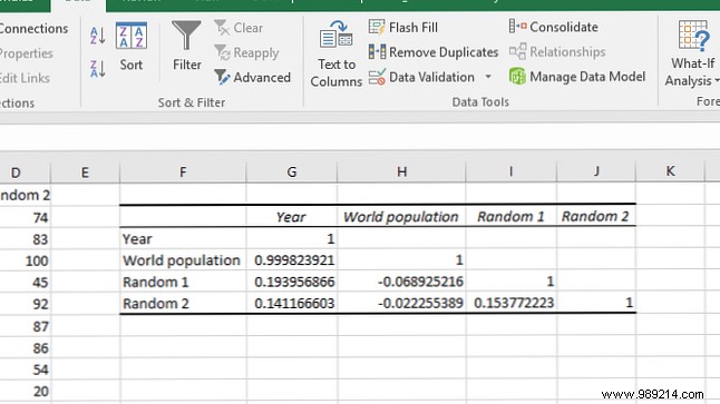
Diagonals are 1 (self-correlation). Year and world population show strong ties; randoms are near zero.
Need ToolPak basics? Check How to Do Basic Data Analysis in Excel.
Correlation shows association, not causation. For predictions, use regression via ToolPak.
Select Regression:
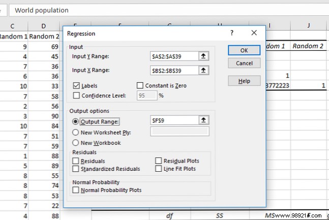
Specify X (predictor) and Y (outcome) ranges:
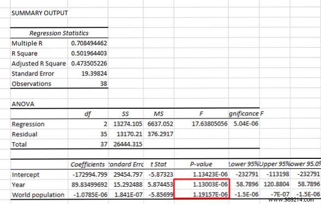
Key: P-value < 0.05 indicates significance.
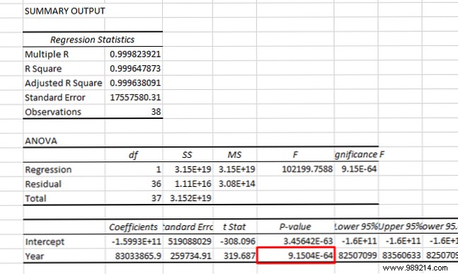
Example: Year significantly predicts population. Multi-regression tests year + population on oil prices—both significant:
For deeper stats, explore free resources: Learn Statistics for Free with These 6 Resources.
Mastering correlation elevates basic spreadsheets to insightful analysis. Start simple, build from there. Beginner? Try 8 Tips to Learn Excel Quickly and How to Calculate Basic Statistics in Excel: A Beginner's Guide.
How do you use Excel correlations? What stats next?