As a seasoned Excel expert with years of experience helping nonprofits and teams track goals, I've created countless thermometer charts for fundraising campaigns, marathons, and project milestones. This simple visualization motivates donors and stakeholders by showing real-time progress toward your target. Whether you're funding a team trip or charity drive, follow this proven tutorial to create your own in Excel 2013 or later versions.
We'll cover basic setup with SUM and percentage formulas, chart customization, advanced tables with dates and donors, dynamic ranges, and SUMIFS for period analysis. Let's get started.
Begin by defining your goal—say, raising funds for a team-building trip. Open a new Excel workbook and create a table with months in column A and amounts raised in column B.
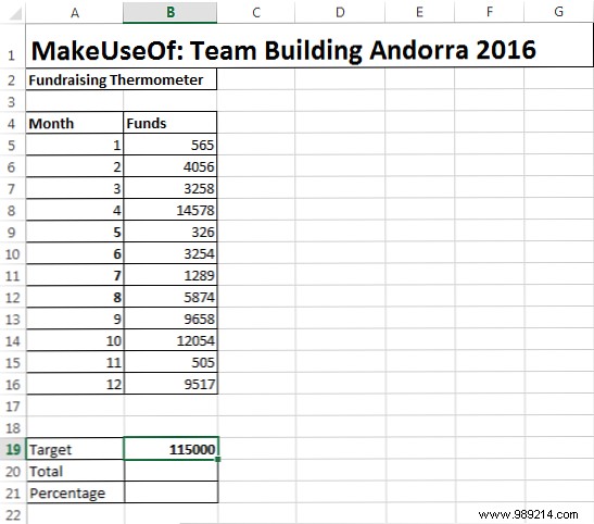
Add these summary cells below your table: Target (e.g., B19), Total (B20), and Percentage (B21).
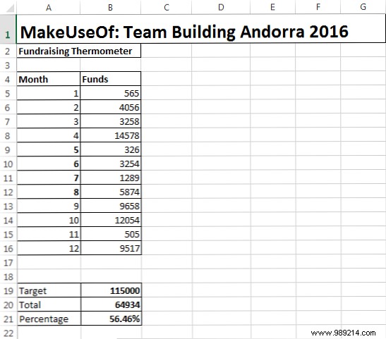
In B20, enter =SUM(B5:B16) (adjust range to match your data). This calculates your running total.
In B21, enter =B20/B19, then right-click the cell, select Format Cells > Percentage, and set decimal places to 0 or 1. Your sheet should now resemble this:
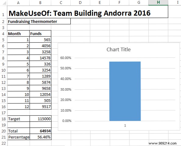
With totals linked, insert the chart: Go to Insert > Column > 2-D Column > Clustered Column.
Right-click the chart > Select Data, and choose your percentage cell (B21). Click OK.
Customize for a thermometer look:
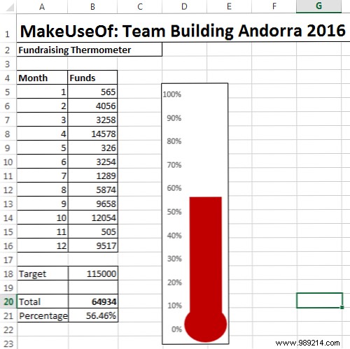
Right-click the bar to change fill color (e.g., red for heat). Your thermometer is ready!
For extended campaigns, expand to a detailed table with Date, Donor, and Amount columns.
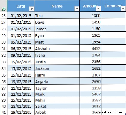
Convert to an Excel Table: Select data > Insert > Table. Update Total to =SUM(Table1[Amount]).
Select your Amount column (e.g., C26:C38) > Formulas > Name Manager > New.
In "Refers to," enter: =OFFSET(Sheet1!$C$1,0,0,COUNTA(Sheet1!$C:$C),1). This auto-expands as you add data.
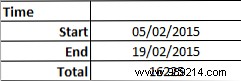
SUMIFS sums based on criteria like date ranges. Enter Start Date (B10), End Date (B11: =B10+14).
In B12: =SUMIFS($C$26:$C$95,$A$26:$A$95,">="&$B$10,$A$26:$A$95,"<="&$B$11).
You've mastered basic formulas, chart tweaks, tables, dynamic ranges, and SUMIFS. Share your thermometer to inspire more contributions. Tracking a charity? This setup scales effortlessly. Questions on other Excel functions? Drop them in the comments!