As a long-time LibreOffice user on Windows 10, I've found it to be a reliable free alternative to Microsoft Office, especially for personal and casual use. While it's continually improving and excels as an open-source suite, font rendering can initially look subpar without tweaks. This was a persistent issue in my workflow until I discovered a straightforward fix.
Based on hands-on testing across versions, including updates beyond 5.1, here's how to make fonts crisp and professional:
Quick steps to enable better rendering:
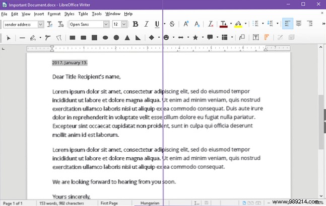
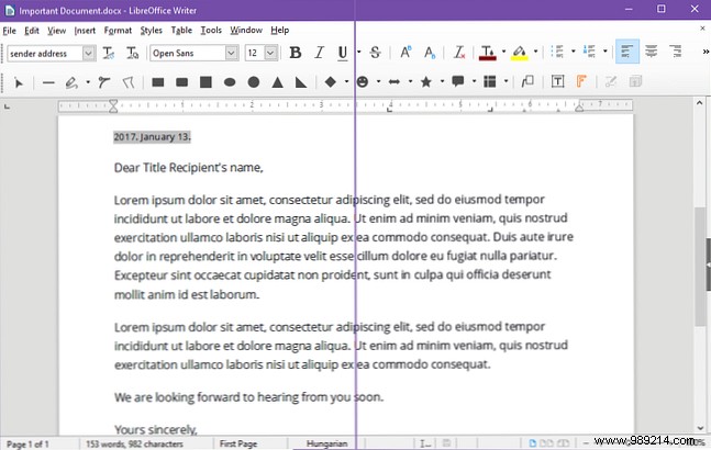
This change transformed text clarity for me—fonts now render smoothly and legibly. The improvement is most dramatic if you're not using ClearType, but it's still noticeable even with it enabled. Compare these before-and-after screenshots:
If you've faced similar font issues, this should resolve them effectively. For more productivity boosts, explore these proven LibreOffice Writer tips. Read more.
Got other LibreOffice tweaks? Share in the comments below!