Plain text in Microsoft Word can feel dull and uninspiring, causing readers' attention to wane. As a seasoned document designer with years of experience optimizing Word files for professionals and students alike, I've seen how subtle typography tweaks transform mundane pages into engaging reads.
Microsoft Word offers powerful, built-in tools to enhance your text without overwhelming the design. A balanced approach adds visual appeal, improves readability, and keeps your audience hooked. Here are five proven tips to elevate your documents.
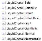
Start by expanding your font library. Download free fonts from trusted sites offering OTF or TTF files—many provide high-quality options for modern designs. Extract any .zip downloads first; you might get variants like 'bold' or 'light' for precise control.
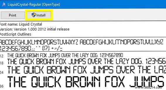
On Windows 10, double-click the font file to open the previewer. With admin rights, click Install to add it system-wide, making it instantly available in Word.
Drop shadows are a timeless design staple for depth and emphasis. In Word, craft one manually using a text box for full customization.
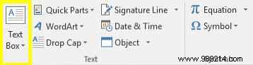
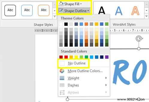
Format your text first (font, size). Copy it, then go to Insert > Text Box. Paste, match styling, and under Shape Format > Shape Styles, set Shape Fill to No fill and Shape Outline to No outline.
Change the text box text color to your shadow shade, right-click > Wrap Text > Behind Text. Position it slightly offset below the original for a natural shadow effect—perfect for overlaying text on images.


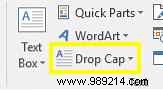
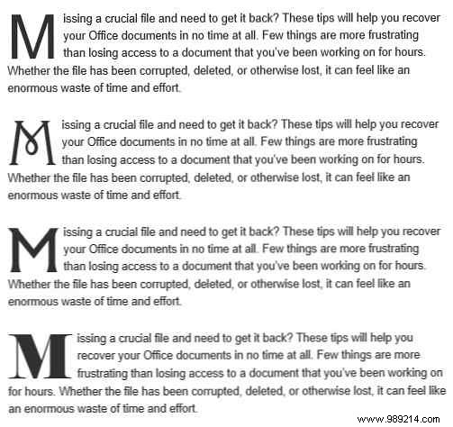
Drop caps lend a classic, professional flair to paragraphs. Place your cursor in the target paragraph, go to Insert > Text group > Drop Cap. Choose Dropped for basics, or Drop Cap Options for tweaks.
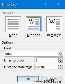
Select Dropped and set Distance from Text to 0.2 cm (0.08 inches)—adjust based on font and scale for seamless integration. Pair sans-serif for bold impact or serif for elegance.
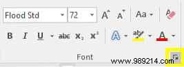
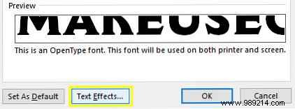
Word's Text Effects add polish when used judiciously, avoiding dated WordArt vibes. Select text, go to Home > Font dialog launcher > Text Effects.
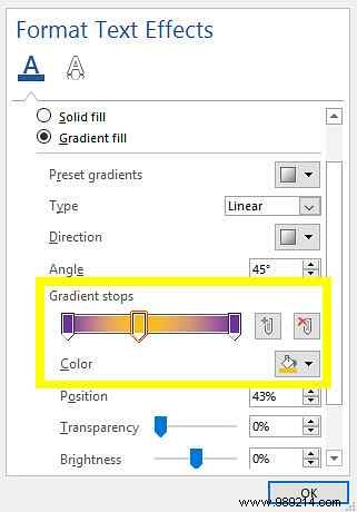
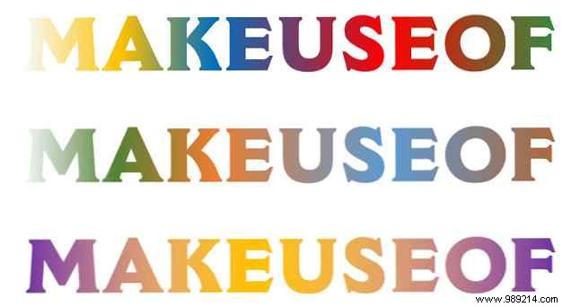
Enhance with Text Fill: Solid Fill for single colors, or Gradient Fill for nuanced blends. Customize gradients by adding stops, picking colors, and ensuring harmony via color theory principles.
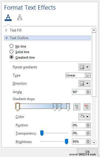
Boost visibility with Text Outline—solid or gradient lines around text. Adjust Weight for thickness, ideal against busy backgrounds.

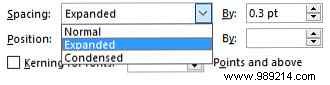
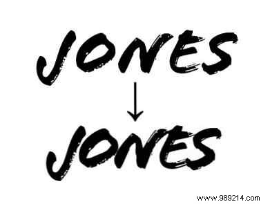
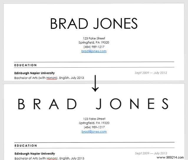
Kerning (character spacing) subtly refines readability and aesthetics. Less is more—reserve for headlines.
Format text first, select it, open Font dialog > Advanced tab > Character Spacing. Choose Expanded or Condensed, set points (e.g., tight for handwriting fonts, wide for minimalism).
These techniques not only beautify but guide the eye, enhancing flow. As experts in typography know, thoughtful formatting boosts engagement.
Got tips for styling text in Word or need help with a specific issue? Share in the comments below.