Master the art of creating stunning, professional charts in Excel 2016 with these proven formatting techniques. Whether for reports, presentations, or data analysis, polished visuals convey insights more effectively than raw numbers.
Charts outperform plain tables for understanding data trends—explore 8 Types of Excel Charts and Graphs and When to Use Them for the best fit. Customize elements like text, colors, data series, and backgrounds to craft distinctive, impactful graphics that showcase your expertise.
With practice, you'll turn basic visuals into standout designs that captivate audiences.
To begin formatting, select your data in Excel, then go to Insert > Charts. Pick the ideal chart type and complete the setup wizard.
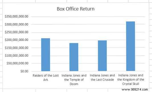
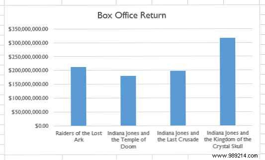
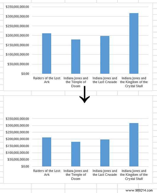
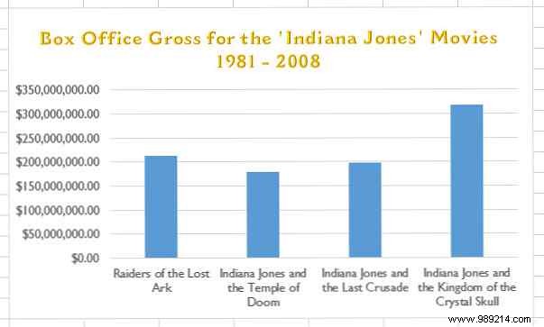
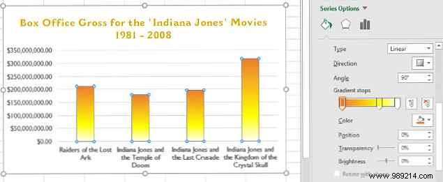
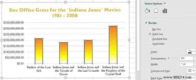
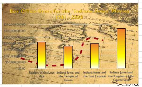
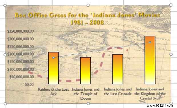
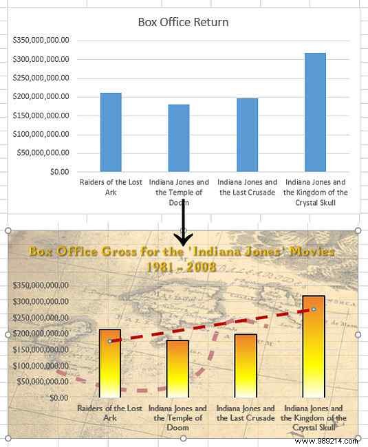
This simple bar chart uses Indiana Jones movie revenues as example data. The steps below apply to any Excel chart type.
Excel's default Calibri font is readable but uninspiring. Custom fonts elevate your chart's professionalism and visual appeal.
Select individual text elements like titles or labels, then choose a font from the Home tab ribbon. For consistency across the chart, right-click the chart area and select Format Chart Area.
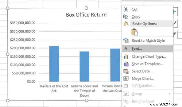
This subtle font tweak—such as switching to a clean sans-serif—sets your chart apart instantly.
For a standout title, delete the default text box (select and press Delete), then resize the chart if needed.
With the chart selected, go to Insert > Text > WordArt and choose a subtle style. Balance flair with readability—avoid overly ornate effects that overshadow data. Discover fonts perfect for visuals in 14 Fonts That Are Perfect for Greeting Cards and Posters.
Y-axis values are straightforward, but X-axis movie titles benefit from extra definition. Add drop shadows for quick readability. Learn more about impactful text in Featured Text: Well-formatted text can grab your reader's attention...
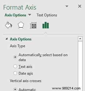
Double-click axis labels to open the Format Axis pane. Go to Text Options > Text Effects > Shadow and apply a preset or customize.
Strategic color use adds vibrancy without overwhelming. Stick to cohesive palettes for professionalism.
Excel themes ensure harmony. Select the chart, then click the paintbrush icon (Chart Styles) in the top-right.
Switch to Colors and preview options—bars fill with theme hues, pie slices get varied shades.
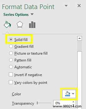
For precision, double-click a data series to open the Format Data Series pane. Under Fill & Line, select Solid fill and pick your shade.
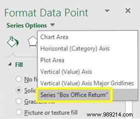
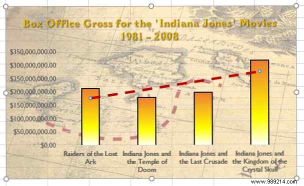
Gradients blend shades for sophistication—see why color matters in design. Select the entire series via Series Options.
Under Fill, choose Gradient fill, adjust stops, and add a subtle border (Solid line, 1 pt width).
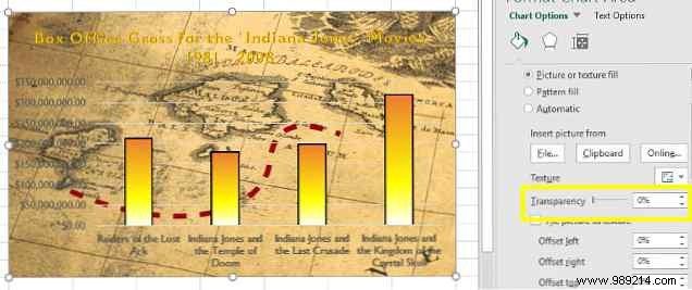
A textured background adds personality—use low-detail images to avoid distraction. Prep in GIMP or Photoshop (GIMP vs. Photoshop: Which is Right for You?).
Double-click the chart background, go to Fill > Picture or texture fill, and insert your file.
Adjust Transparency to 50% (tweak as needed) for legibility.
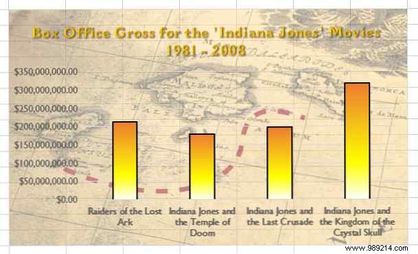
Polish with optional features.
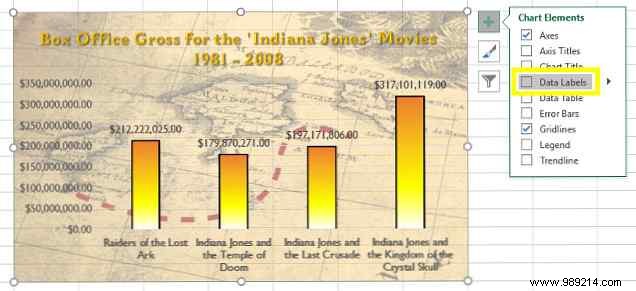
Click the chart's + icon, check Data Labels, and format as needed.
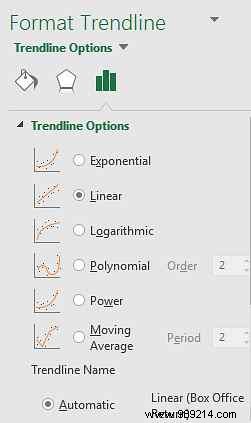
Likewise, add a Trendline and format it to match your theme.
For precision, under Trendline Options, select equations like polynomial—ideal for academic work. Resources like The 20 Websites You Need to Learn Math Step by Step can help.
Excel's tools make pro-level charts accessible. Start with a clear vision to ensure cohesion.
Focus on purpose over excess—Brainstorming Ideas Doesn't Have to Be Difficult. Soon, your charts will impress.
Share your favorite Excel chart tips or ask for help in the comments!