Access to vast data and metrics reveals business strengths and weaknesses, but raw numbers are tough to interpret without visualization tools. Whether enhancing your analysis or presenting findings, Microsoft Power BI integrates seamlessly with Excel, offering advanced data management to turn complexity into clarity.
Power BI empowers users to transform data into dynamic visualizations and reports. Start mastering it today with our step-by-step guide.
Power BI is a fast, flexible platform that converts data into interactive charts, graphs, and reports. It dynamically updates visuals as new data arrives, providing more streamlined control than Excel's native tools.
Dashboards assemble multiple charts and datasets into a cohesive view, making key metrics easy to digest. Once configured, they deliver ongoing insights with minimal maintenance, and edits are straightforward.
Microsoft offers free trials, making it ideal to explore Power BI's potential for your business.
Begin by registering on the Power BI web portal. Then, import data to test its features. Power BI supports Excel files, CSVs, and integrations like Salesforce. Use Microsoft's sample dataset for a quick demo.
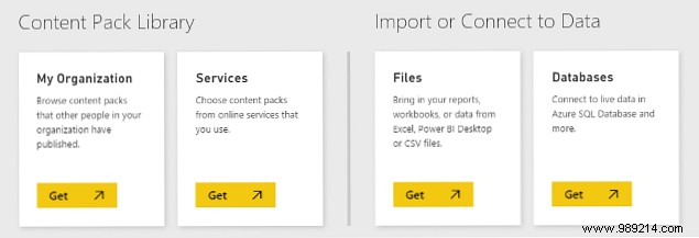
Click Get Data in the bottom left. For the sample, select Files > Get > Local file and browse to it.
With data loaded, select it to access visualization options on the right. Drag fields like Country and Profit from the Fields pane to create charts.
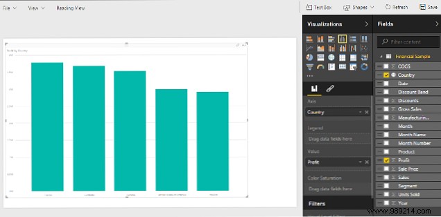
This defaults to a clustered column chart, but switch to pie charts, maps, or more via the Visualizations pane.
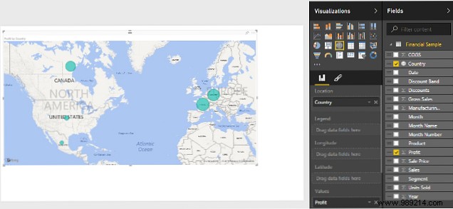
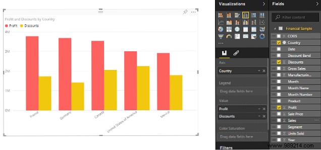
Customize further or combine fields for richer views.
Pin visuals to a dashboard using the pin icon for quick access and reference.
Dashboards combine pinned reports for a comprehensive data overview. Arrange them for at-a-glance insights.
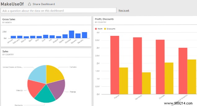
Tweak layouts for clarity, then drill down by clicking tiles. Share via email invites.
Use natural language Q&A, like "profit in France?" or "gross sales 2014?" for instant answers based on your data fields.
With basics covered, refine dashboard layouts for expert-level impact. Follow Microsoft's Power Query guides and Office integration docs.
Share your Power BI tips in the comments below.